Here’s something that’ll blow your mind: the way fintech companies decide whether to lend you money is getting a serious upgrade. And I’m not talking about minor tweaks to old formulas — I’m talking about reinforcement learning algorithms that literally learn from every lending decision they make.
SHAP Values in Python: Explain Your Machine Learning Model Predictions
on
Get link
Facebook
X
Pinterest
Email
Other Apps
You know that awkward moment when your machine learning model makes a prediction and someone asks, “Yeah, but why did it predict that?” And you’re just standing there like… “Uh, math happened?”
Not exactly confidence-inspiring, right?
Here’s the thing: building accurate models is only half the battle. The other half? Actually explaining what the heck your model is doing. That’s where SHAP (SHapley Additive exPlanations) comes in, and trust me, once you start using it, you’ll wonder how you ever lived without it.
I remember the first time a stakeholder asked me to explain why our model rejected a loan application. I mumbled something about “feature importance” and got the blankest stare imaginable. Then I discovered SHAP values, and suddenly I could show them exactly which factors influenced each decision. Game changer.
Let’s dive into how SHAP works, why it’s brilliant, and how you can start using it today to make your models actually interpretable.
SHAP Values in Python
What Are SHAP Values Anyway?
SHAP values are a way to explain individual predictions by measuring each feature’s contribution to that specific prediction. Think of it like this: imagine you’re splitting a restaurant bill among friends, and you need to figure out how much each person should pay based on what they ordered. That’s essentially what SHAP does — it fairly distributes the “credit” for a prediction among all your features.
The math behind SHAP comes from game theory (specifically, Shapley values from cooperative game theory). Sounds fancy, but the core idea is simple: how much does each feature contribute to pushing the prediction away from the baseline?
Here’s what makes SHAP special:
Model-agnostic: Works with any ML model — Random Forests, XGBoost, neural networks, you name it
Locally accurate: Explains individual predictions, not just global patterns
Consistent: If a feature contributes more, it gets more credit (unlike some other methods)
Additive: All SHAP values sum up to explain the total prediction
Ever wondered why one method became the gold standard while others faded away? SHAP hit that sweet spot of mathematical rigor and practical usability. It’s not just theoretically sound — it actually works in real-world scenarios.
Installing SHAP: Getting Your Toolkit Ready
Let’s get this party started. Installing SHAP is straightforward:
pip install shap
That’s it. The library plays nice with all the major ML frameworks — scikit-learn, XGBoost, LightGBM, CatBoost, PyTorch, and TensorFlow. Pretty much everything you’re likely to use.
Quick heads up: If you’re working with large datasets or complex models, some SHAP calculations can be slow. Not dealbreaker-slow, but grab-a-coffee-slow. We’ll talk about optimization tricks later.
I always install it in a fresh environment to avoid dependency headaches:
FYI, SHAP works beautifully with Jupyter notebooks, which I highly recommend for exploratory analysis. The visualizations are interactive and look gorgeous.
Your First SHAP Analysis: A Simple Example
Let’s build something real. I’ll use a Random Forest classifier on the classic Iris dataset — simple enough to understand, but still useful for demonstration.
Loading Data and Training a Model
python
import shap import pandas as pd from sklearn.ensembleimportRandomForestClassifier from sklearn.model_selectionimport train_test_split from sklearn.datasetsimport load_iris
# Load data
iris = load_iris()
X = pd.DataFrame(iris.data, columns=iris.feature_names)
y = iris.target
# Split data
X_train, X_test, y_train, y_test = train_test_split(X, y, test_size=0.2, random_state=42)
# Train model
model = RandomForestClassifier(n_estimators=100, random_state=42)
model.fit(X_train, y_train)
Nothing crazy here — standard ML workflow. Now comes the fun part.
Creating a SHAP Explainer
SHAP has different explainer types depending on your model. For tree-based models like Random Forest, use TreeExplainer (it’s super fast):
# Calculate SHAP values for test set
shap_values = explainer.shap_values(X_test)
Boom. You’ve just calculated SHAP values for every prediction in your test set. Each value tells you how much that specific feature contributed to that specific prediction.
What’s happening under the hood? SHAP is computing the marginal contribution of each feature by considering all possible combinations of features. Sounds computationally expensive, right? It would be — except TreeExplainer uses clever optimizations specific to tree-based models, making it blazingly fast.
Visualizing SHAP Values: Making Sense of the Numbers
Raw SHAP values are just numbers in arrays. The real magic happens when you visualize them. SHAP comes with several built-in plots that are honestly some of the best ML visualizations I’ve seen.
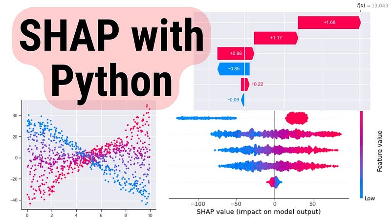
Want to explain one specific prediction? Force plots are your friend:
python
# Explain the first prediction
shap.initjs()  # For notebook visualization
shap.force_plot(explainer.expected_value[0],
                shap_values[0][0],
                X_test.iloc[0])
This creates an interactive visualization showing:
Base value: The average prediction across all training data
Red arrows: Features pushing the prediction higher
Blue arrows: Features pushing the prediction lower
Final prediction: Where you end up after all features contribute
I love showing these to non-technical stakeholders. They get it immediately — no PhD required.
Waterfall plots show how each feature moves the prediction from the base value to the final output:
python
shap.plots.waterfall(shap_values[0])
This is my go-to when explaining individual predictions in presentations. It’s clean, intuitive, and tells a clear story: “We started here, this feature moved us up, that feature moved us down, and we ended here.”
Summary Plot: Global Feature Importance
Want to see which features matter most across your entire dataset? Summary plots are perfect:
python
shap.summary_plot(shap_values, X_test)
This creates a bee swarm plot showing:
Features ranked by importance (top to bottom)
Distribution of SHAP values for each feature
Color-coding showing whether high feature values increase or decrease predictions
Here’s why this beats traditional feature importance: It shows you not just which features are important, but how they affect predictions. Traditional feature importance might tell you “petal length matters,” but SHAP shows you “high petal length strongly increases the prediction, while low values decrease it.”
These plots reveal non-linear relationships and interactions between features. You might discover that “petal length only matters when petal width is above a certain threshold” — insights you’d miss with simpler methods.
Working with Different Model Types
SHAP isn’t just for Random Forests. Let’s look at how it handles other popular models.
XGBoost and LightGBM
Tree-based gradient boosting models? TreeExplainer handles them beautifully:
python
import xgboost as xgb
# Train XGBoost model
xgb_model = xgb.XGBClassifier(n_estimators=100)
xgb_model.fit(X_train, y_train)
Linear models are fast to explain since the relationships are… well, linear. Makes sense.
Neural Networks
Deep learning models need DeepExplainer (for TensorFlow/Keras) or GradientExplainer (for PyTorch):
python
import tensorflow as tf
# Assuming you have a trained Keras model
# explainer = shap.DeepExplainer(model, X_train[:100])
# shap_values = explainer.shap_values(X_test)
Heads up: Explaining neural networks is computationally intensive. I usually sample a subset of training data for the background dataset (like 100–500 samples) to keep things manageable.
Black-Box Models: KernelExplainer
Got a completely custom model or something exotic? KernelExplainer works with anything — as long as you can pass data in and get predictions out:
python
# Works with ANY model
explainer = shap.KernelExplainer(model.predict_proba, X_train[:50])
shap_values = explainer.shap_values(X_test[:10])
Warning: KernelExplainer is model-agnostic, which means it’s slow. Like, really slow for large datasets. Use it as a last resort when specialized explainers aren’t available.
Real-World Example: Credit Risk Modeling
Let’s tackle something practical. Imagine you’re building a credit risk model that predicts loan defaults. Regulators and customers will demand explanations — SHAP can provide them.
The Scenario
python
import numpy as np
# Simulated credit data
np.random.seed(42)
n_samples = 1000
# Show summary
shap.summary_plot(shap_values, X_test)
Now you can see exactly which factors drive default predictions. High debt ratio? Big red impact.High credit score? Big blue impact pushing default probability down. This transparency is crucial for:
Regulatory compliance: Prove your model isn’t discriminatory
Customer service: Explain rejections clearly
Model debugging: Spot when your model learns weird patterns
IMO, if you’re deploying models that affect people’s lives (loans, insurance, healthcare), using SHAP isn’t optional — it’s an ethical requirement.
Advanced SHAP Techniques
Once you’re comfortable with basics, these advanced tricks will level up your game.
SHAP Interaction Values
Sometimes features don’t work alone — they interact. SHAP can quantify these interactions:
python
# Calculate interaction values (only for TreeExplainer)
shap_interaction = explainer.shap_interaction_values(X_test)
# Visualize interactions for specific feature
shap.dependence_plot(
    ("credit_score", "debt_ratio"),
    shap_interaction,
    X_test
)
This reveals whether the effect of credit score depends on debt ratio levels. Powerful stuff for understanding complex models.
Partial Dependence Plots
Combine SHAP with partial dependence plots to see average feature effects:
These show how predictions change as you vary one feature while holding others constant.
Clustering SHAP Values
Got tons of predictions and want to find patterns? Cluster them by SHAP values:
python
shap.plots.heatmap(shap_values[:100])
This groups similar explanations together, helping you identify different “types” of predictions your model makes.
Common Pitfalls and How to Avoid Them
After using SHAP extensively, here are mistakes I’ve seen (and made myself):
1. Forgetting the baseline. SHAP values are relative to the expected value (average prediction). A SHAP value of +0.3 means “this feature increased the prediction by 0.3 compared to average.” Context matters.
2. Misinterpreting correlation as causation. SHAP shows contribution, not causation. If two features are highly correlated, SHAP might split credit between them unpredictably.
3. Using too much data with KernelExplainer. Seriously, sample your background dataset. 50–100 samples usually suffice:
4. Ignoring computational cost. For production systems, pre-compute SHAP values during training rather than calculating them on-demand. :/
5. Not standardizing features. While SHAP works with any scale, visualizations are clearer when features are on similar scales. Consider standardization for better plots.
SHAP in Production: Practical Considerations
Want to deploy SHAP explanations in real applications? Here’s what you need to know:
Pre-computing Explanations
For batch predictions, compute SHAP values offline:
python
# During model training
explainer = shap.TreeExplainer(model)
# Save explainer
import pickle
with open('explainer.pkl', 'wb') as f:
    pickle.dump(explainer, f)
# Later, in production
with open('explainer.pkl', 'rb') as f:
    explainer = pickle.load(f)

shap_values = explainer.shap_values(new_data)
Serving Explanations via API
Wrap SHAP in a simple API for real-time explanations:
python
from flask importFlask, request, jsonify
app = Flask(__name__)
@app.route('/explain', methods=['POST']) def explain_prediction(): data = request.json input_data = pd.DataFrame([data])
This lets your application request explanations on-demand. Perfect for customer-facing interfaces.
Performance Optimization
For high-throughput systems, optimize SHAP calculations:
Use TreeExplainer when possible (10–100x faster than KernelExplainer)
Batch predictions instead of one-at-a-time
Cache explanations for similar inputs
Consider approximate methods like shap.TreeExplainer(..., feature_perturbation='tree_path_dependent') for speed
Why SHAP Beats the Alternatives
You might be thinking, “Can’t I just use regular feature importance?” Well, sure — but you’d be missing out. Here’s why SHAP is superior:
Traditional feature importance only shows global importance. It can’t explain why a specific prediction happened.
LIME (another popular explainer) can be inconsistent — two similar instances might get wildly different explanations. SHAP is mathematically guaranteed to be consistent.
Permutation importance is slow and can give misleading results when features are correlated.
SHAP combines the best aspects of all these methods while avoiding their pitfalls. It’s theoretically solid and practically useful — a rare combination in ML tools.
Final Thoughts
Look, building accurate models is great and all, but if you can’t explain them, you’re leaving massive value on the table. SHAP bridges that gap between “black box that works” and “transparent system people actually trust.”
I’ve used SHAP to debug models that looked perfect on paper but were learning stupid patterns (like predicting loan defaults based on the day of the week — yeah, that happened). I’ve used it to win over skeptical executives who didn’t trust ML. I’ve used it to comply with regulations that demand explainability.
The best part? It’s not even that hard. Install the library, create an explainer, generate some plots — you’re explaining predictions in minutes. The hard part is actually using those insights to make better models and better decisions.
So next time someone asks “why did your model predict that?” — don’t mumble about math. Show them a SHAP plot and watch their eyes light up with understanding. That’s the kind of data science that actually makes an impact.
Now go forth and explain some models. Your stakeholders (and your conscience) will thank you. :)

Comments
Post a Comment